The current Open States website has served us well. It’s a crucial gateway for citizens to track, search, and learn about their representatives and bills, and receives hundreds of thousands of hits per month when legislatures are in session.
But at six years old, the interface is starting to show its age, in both usability and visual design. Most significantly, openstates.org is not mobile-responsive, a bad experience for smartphone and tablet users. Previously, Sunlight had published Open States mobile apps, but as a volunteer-powered independent organization, Open States doesn’t have the resources to maintain those alongside the website. It’s also more common nowadays to simply build responsive websites, rather than release separate mobile apps.
So, when we needed to update openstates.org to use the Open Civic Data infrastructure, James and I decided to invest in a significant refresh.
We’ve been working with Olivia Cheng, designer and front-end developer, to improve the visual feel of the website. Through exposure to the project while at Sunlight, and via conversations with James and myself, Olivia has applied a modern design eye to the data we publish.
 One potential refreshed Open States logo
While I’m not the right person to discuss the theory and best-practices behind the upcoming openstates.org, Olivia plans to explain these in a future blog post. In the meantime, I’d like to share some screenshots of our existing site, compared with Olivia’s refresh!
 Current legislator card
 Updated legislator card
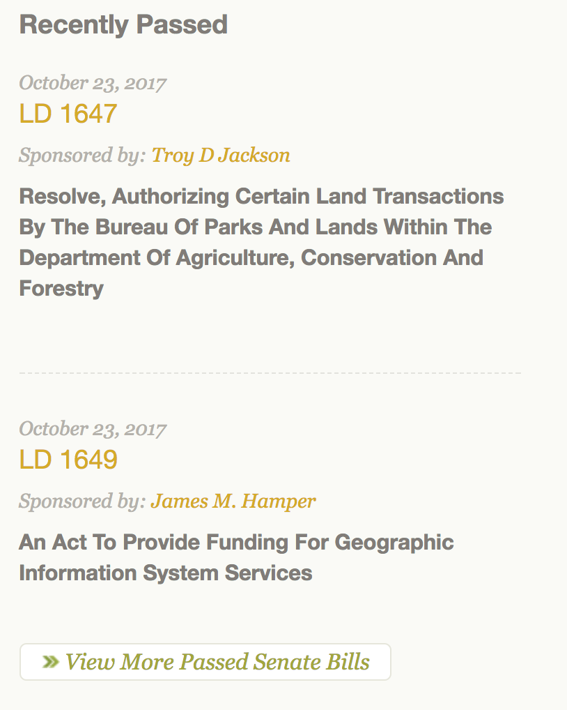
 Current “recent legislation” list
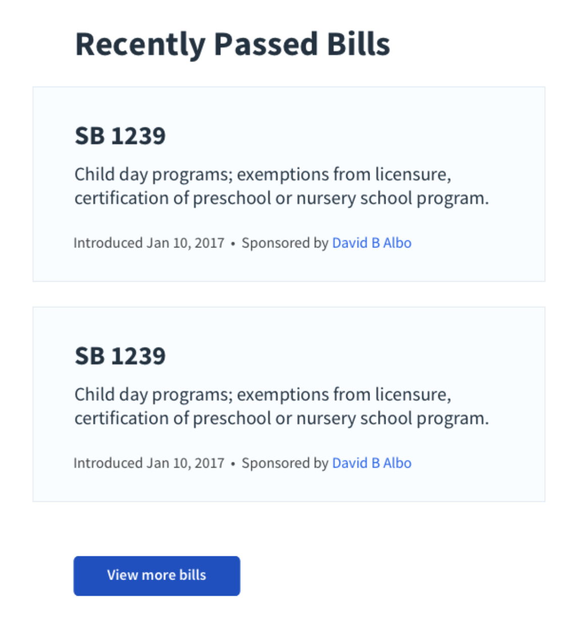
 Updated “recent legislation” list
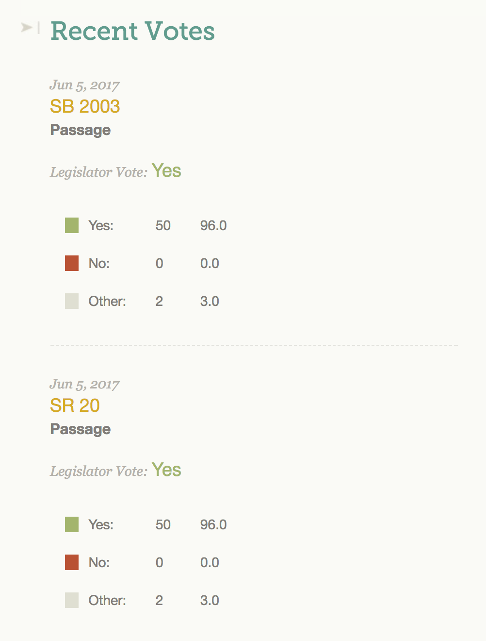
 Current legislator vote list
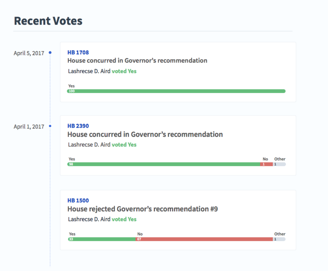
 Updated legislator vote list
With the visual elements mainly finished, we’re about ready to build out the website itself in Django and React. We hope to launch a version of the site in early 2018.
We want to thank our supporters for making this redesign possible, as well as our other big forthcoming releases, like API version 2. Stay tuned here for additional blog posts, as we wrap up 2017 and head into the new year.